
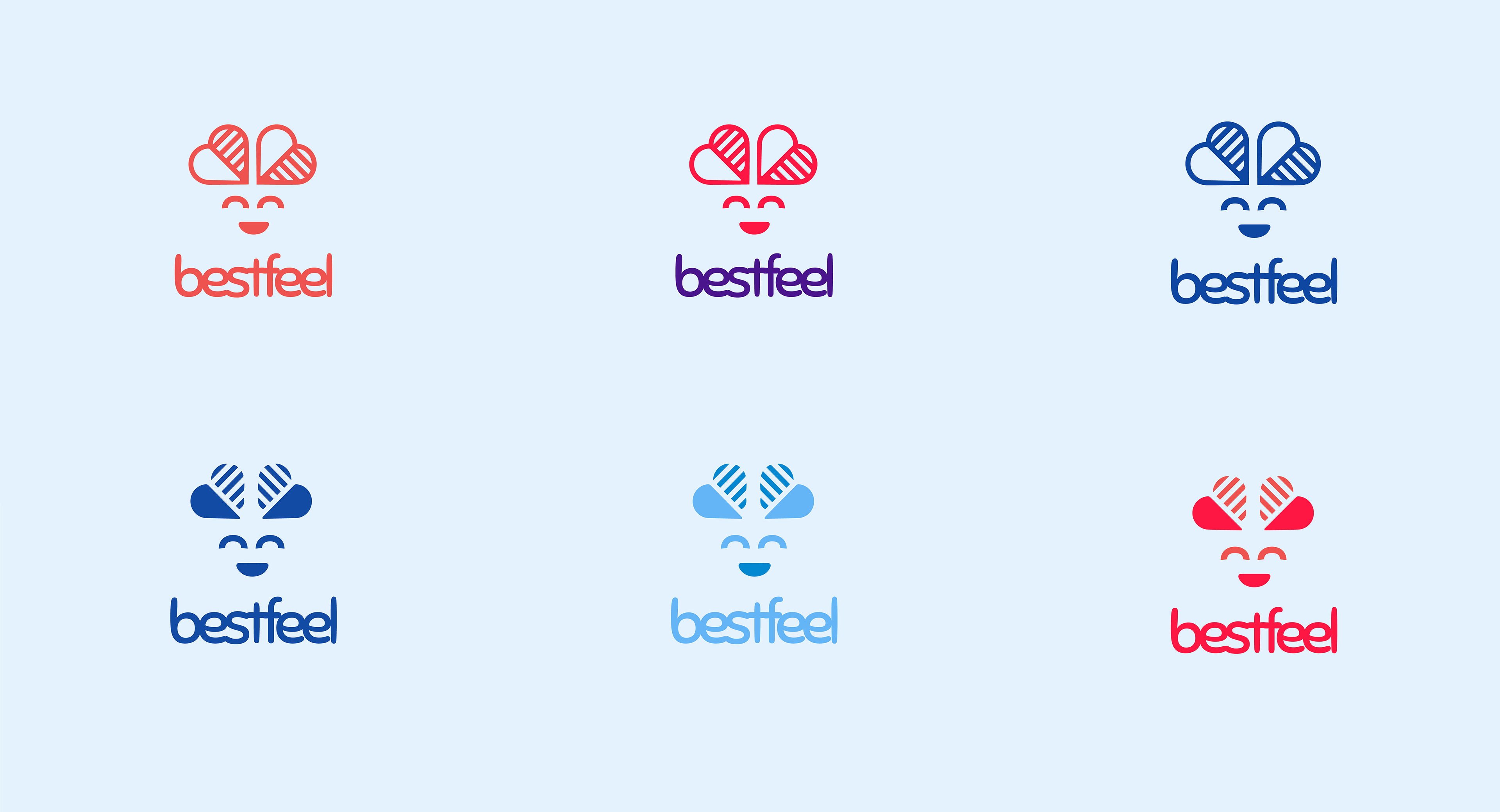
The upper picture is the final logo we agreed on. But to create this logo I had to go a long way and created many other logos. Here is the evolution process
First I thought the word "bestfeel" reminds me of love. Usually people refer to love when they talk about the best feelings they had. So this was one of the first things that came to my mind

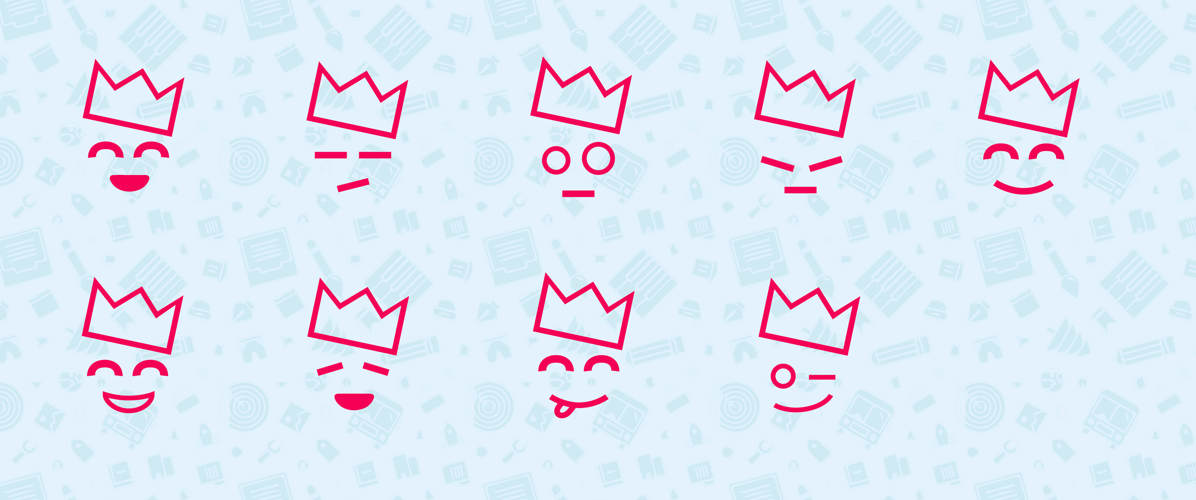
Then I thought a crown could be nice as well since it is the representation of the "best" word. But just crown would be too tritely for an entertainment website, that is why I decided to make it an exited crown.

Everybody liked the idea that the logo had face. So I decided to keep the face part but to change the crown. The first thing that came to my mind was crown in shape of heart. And the result looked really nice.
Of course I could already stop, but just before finishing my work I decided to try one more thing. The idea was to keep the face and try few different types of crown. I really liked the outcome and so did the team.

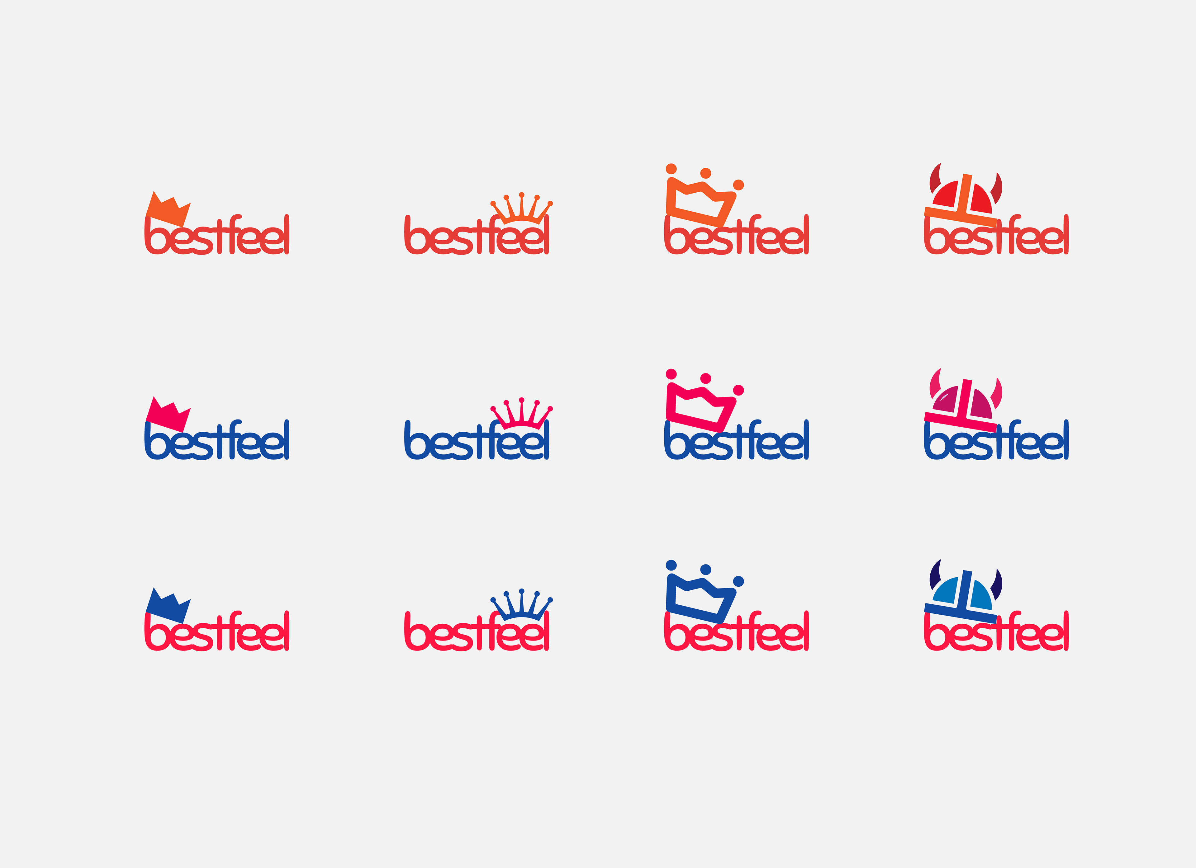
I started trying out different colors...
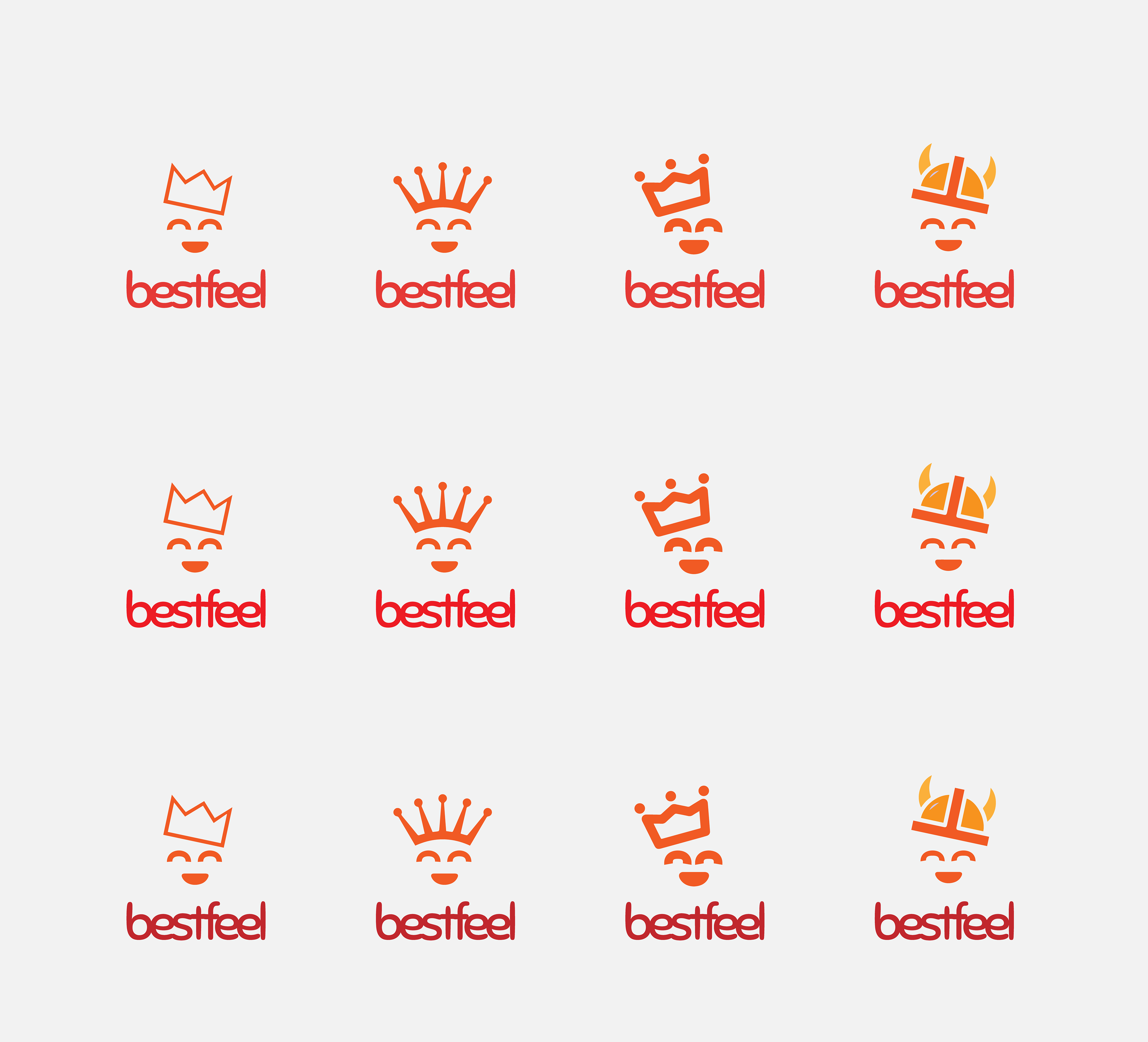

Text version of logo was something that marketing team wanted as well, I couldn't agree more.

And who doesn't love emojis? :) Nice set of emojis would be used to rate the website content.